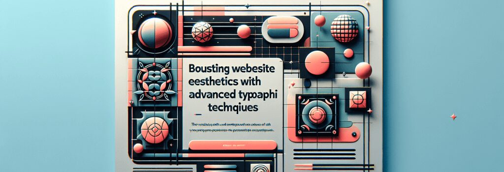
Boosting Website Aesthetics with Advanced Typography Techniques

Alright, picture this! You’ve just baked the perfect chocolate chip cookie. It’s scrumptious and delectable, it’s got all the ingredients just right; the texture, the melt-in-your-mouth quality is all on point. But you, being an ambitious cookie connoisseur, aren’t content with just baking the perfect cookie. No! You decide to take it a notch higher by icing it up, tossing in some sprinkles, all to make it even more enticing.
Much like baking, web development revolves around creating the perfect website (or cookie, if you’d like), plus the extra add-ons to make the site irresistibly appealing. That’s where advanced typography techniques come into play!
Understanding Advanced Typography
If you asked a rookie what typography is, he might say it’s about choosing a pretty font. It’s like saying Leonardo da Vinci’s Mona Lisa is a fine doodle. Typography, folks, is more than just ‘picking pretty fonts’. It’s a key factor that goes into enhancing the aesthetic appeal of a site, improving readability and setting the tone and character of the website.
Why Typography Matters
The text on your website isn’t just there to convey information. It’s also there to guide your visitors, make their experience enjoyable, and encourage them to take specific actions. Great typography can make the process of reading effortless, leading to longer visits and more interaction.
A New Height of Web Typography
Typography has come a long way in web design, far from the days of Comic Sans reign. Today, we can leverage advanced typography techniques to create websites that are visually stunning and effective.
Manipulating White Space
Think of white space as the breathing room for your text. It’s the space around and between the elements of your page, and it’s a powerful tool when used correctly.
Fancy Schmancy Headlines
My dear web developers, headlines aren’t to be chosen lightly. A perfect choice of font for the headlines can set the tone for the entire site. One good rule of thumb is to choose a font for your body copy and then another contrasting font for your headlines.
The Magic of Pairing Fonts
Just like that hilarious buddy-cop movie where the surly veteran is paired with the bumbling rookie, some fonts just work better together. Simply by pairing fonts, you can create a visual hierarchy, define different areas of your website, and create a more exciting design.
The Magnitude of Contrast
To lace your site with a pinch of drama and impact, play with contrast. Light fonts against a dark background or vice versa can create fantastic results.
The Dancing Letter-Space
Letter-spacing is a subtle but powerful way to make your text more readable, especially with large blocks of text.
So, fellow coders, next time you’re whipping up a website, remember: Typography isn’t just the icing on your code-cake, it’s the cherry, sprinkles, and the silverware! Beyond functionality and user-friendly interface, never underestimate the power of a delightful visual feast to draw in your audience. Happy coding!


