Posts with tag “media queries”
Learn how to create responsive and adaptive websites by mastering media queries. Explore how to apply CSS rules based on the characteristics of the user’s device, such as screen size, orientation, and resolution. Discover best practices for using media queries to create a seamless browsing experience across various devices.
Read more
Optimizing Performance with CSS Best Practices and Techniques
Creating an efficient and visually appealing website is an integral part of web development. ...

Responsive Web Design with CSS: A Beginner’s Guide
Responsive Web Design with CSS: A Beginner's GuideIn today's rapidly evolving digital landscape, responsive ...

Crafting Responsive Web Designs with Media Queries
In today's digital era, where the variety of devices accessing the web is broader ...

The Art of Creating Fluid Layouts in CSS
Creating fluid layouts that adapt seamlessly to a range of devices, from desktops to ...
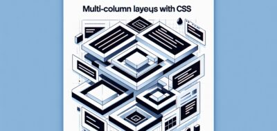
Implementing Multi-Column Layouts with CSS
Creating Multi-Column Layouts: A Guide to CSS TechniquesIn the world of web development, mastering ...

Tips for Designing Mobile-First Websites
Designing with a mobile-first approach is essential in today's digital landscape. As more people ...

Building Adaptive User Interfaces with CSS
Creating adaptive user interfaces is a vital part of modern web development. As the ...

Responsive Design Techniques for WordPress Themes
Responsive design is integral in creating websites that provide an optimal viewing experience across ...

Mastering CSS for WordPress Theme Design
---Creating visually stunning websites on WordPress is an attainable goal for anyone willing to ...

Building Responsive WordPress Themes with HTML and CSS
Introduction to Responsive WordPress ThemesIn the current digital age, having a responsive website is ...

Mastering HTML and CSS: Tips for Building Responsive Websites
Mastering HTML and CSS: Essential Tips for Building Responsive WebsitesIn the rapidly evolving world ...

Responsive Design: Making Your Portfolio Mobile-Friendly
In today's digital age, having an online portfolio is essential for any aspiring web ...

Responsive Design in Action: Demonstrating Your CSS and HTML Expertise
Introduction to Responsive DesignIn the digital age, the proliferation of devices with varying screen ...

Responsive Web Design with HTML and CSS
---Mastering Responsive Web Design with HTML and CSSIn today’s digital era, creating websites that ...

Responsive Web Design with HTML5 and CSS by Ben Frain
---In today's fast-paced digital landscape, mastering the art of responsive web design is essential ...