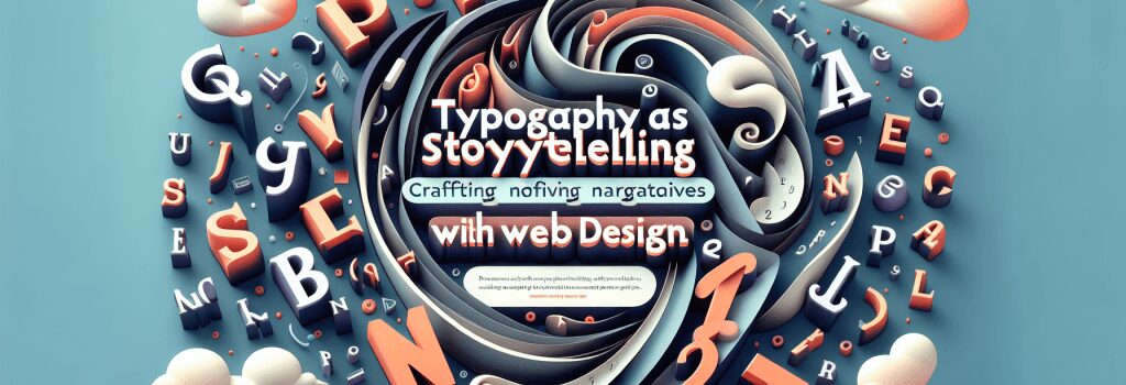
Typography as Storytelling: Crafting Narratives with Text in Web Design

Introduction to Typography in Web Design
Typography in web design is not merely about choosing attractive fonts. It’s a crucial tool for communication, capable of setting the tone, conveying emotion, and, most importantly, telling a story. A well-considered typographic approach can elevate a web design from functional to evocative, guiding users through a narrative that enhances their experience and connection with the content.
Crafting Narratives with Typography
Understanding Typography’s Role
Typography involves the selection and arrangement of type to make written language legible, readable, and appealing. In the context of web design, typography extends beyond font choice to include structure, hierarchy, and the interplay between text and other design elements.
The Power of Type in Storytelling
Each font holds its own personality – some convey trust and reliability, while others exude elegance or excitement. By carefully selecting fonts that align with the message and tone of the website, designers can craft a visual narrative that complements and enhances the written content.
Key Principles of Typography in Web Design
Choosing the Right Font
Select fonts that reflect the site’s purpose and audience. Consider readability across devices and ensure that the font supports the range of characters needed for your content.
Establishing Hierarchy
Use varying font sizes, weights, and colors to create a hierarchy that guides the reader through the content effortlessly. Headlines, subheadings, and body text should be clearly distinguishable.
Consistency is Key
Maintain a consistent typographic scheme throughout the website. A limited selection of fonts helps in creating a cohesive visual story and improves user experience.
Embracing White Space
White space, or negative space, around text blocks is crucial. It helps in making content more digestible and allows the typography itself to stand out, making the narrative more powerful.
Applying Typography in Web Design
Headlines as Story Starters
Headlines are the entry point to your story. They should be engaging and in a font that captures the essence of your narrative, enticing users to read on.
Body Text That Breathes
The body text is where the bulk of your story lives. It should be in a highly readable font, with enough line-spacing and margin for comfortable reading.
Calls to Action as Plot Twists
Calls to action (CTA) are the climax of your story, guiding users towards an action. Use distinctive typography here to draw attention and suggest urgency or importance.
Conclusion
In web design, typography is a powerful storytelling tool, capable of creating atmosphere, emotion, and emphasis. By understanding and skillfully applying the principles of typography, web designers can craft compelling narratives that not only convey information but also engage and move the audience. Remember, every type choice you make on your website is part of the story you’re telling.
Embrace typography in your web designs and let the text do more than just communicate information – let it tell a story.


