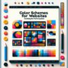
The Importance of Contrast in Web Design: Color and Typography

“Creating an impactful and visually appealing website goes beyond just having a great layout and high-quality content. The design elements you choose, especially in terms of color and typography, play a significant role in ensuring your site not only stands out but is also accessible and user-friendly. One design principle that should never be overlooked is contrast. In this article, we’re delving into the importance of contrast in web design, focusing on how it affects color schemes and typography choices, and ultimately, the user experience.
Understanding Contrast in Web Design
Contrast, in the context of web design, refers to the difference in visual properties that makes an object distinguishable from other objects and the background. In terms of color, it’s about how hues stand out from each other, while in typography, it involves how text is distinguishable from its background, ensuring readability and legibility.
Why Is Contrast Critical?
High contrast makes your website not only more legible but also more navigable. It guides a viewer’s attention to the most important parts of your page, like calls-to-action (CTAs) and key information. In an age where website visitors expect immediate information and gratification, having a design that quickly directs them to what they need is invaluable.
Contrast in Color
Color contrast is vital for making your content pop and grab attention. But it’s not just about aesthetics; it’s also about accessibility. For individuals with visual impairments, such as color blindness, appropriate contrast levels are crucial for navigating and understanding your site.
Best Practices for Color Contrast
– Use Tools for Color Selection: Various online tools can help you choose a color palette that complies with accessibility standards, specifically ensuring sufficient contrast ratios.
– Mind the Mood: Colors evoke emotions, and your choices should reflect the mood and tone you want for your website. Contrast can enhance these emotional cues, making your site more effective in communication.
Contrast in Typography
Typography involves the selection of typefaces, their arrangement, and appearance. Contrast in typography doesn’t just mean color; it also includes font weight, size, and style. Effective contrast in typography ensures that your texts are not only appealing but also readable.
Enhancing Readability with Contrast
– Vary Font Weights and Sizes: Using different weights and sizes can create a hierarchy, making your content easier to scan and understand.
– Consider Background Colors: Ensure sufficient contrast between the text color and the background to avoid straining the eyes of your readers.
Accessibility and Compliance
Adhering to Web Content Accessibility Guidelines (WCAG) for contrast is non-negotiable if you aim to make your site accessible to everyone. It recommends a contrast ratio of at least 4.5:1 for normal text and 3:1 for large text.
Concluding Thoughts on Contrast
Incorporating effective contrast in your web design, regarding both color and typography, is essential for creating a site that’s both beautiful and functional. It’s an aspect of design that directly impacts user experience, engagement, and accessibility. By applying the principles and practices outlined above, you can ensure that your website not only catches the eye but is also a joy to navigate for all users.”
Ensuring that your web design incorporates effective contrast techniques can significantly elevate the user’s experience, making your site not only visually appealing but also accessible and user-friendly for a diverse audience.


