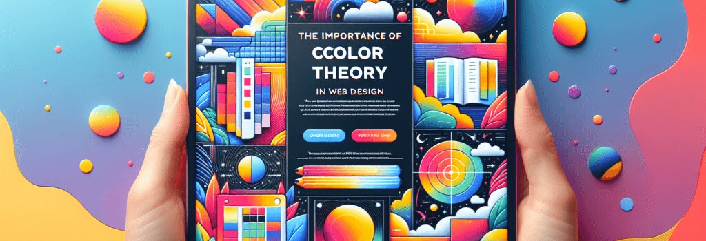
The Importance of Color Theory in Web Design

Welcome, my future web artistes! We are on a fun-filled journey to learn web development, and today, we will dip our creative brushes into the vibrant world of color theory. Get ready to paint the web with your unique hues!
Understanding Color Theory
The first step to becoming a Picasso of web design is unraveling the enigmatic world of color theory. It’s not rocket science; it’s like a game of Candy Crush. You just need to know which colors pop and make the entire website look delicious!
Color theory is the science and art of using colors. It explains how we perceive and interpret colors and how they can be mixed, matched, and contrasted for stunning visual effects. It is the secret recipe behind why Facebook is blue, and why Hulk, despite being green, is still angry!
Why Color Theory Matters in Web Design
Here’s an interesting fact: It takes roughly 90 seconds for a person to form an opinion about a product, and up to 90% of that assessment can be based on color alone! Yes, that’s the power of color.
By understanding color theory, you can stimulate specific emotions, guide users’ eyes to important elements, and make navigation easier. With the right colors, your website can be more than just functional – it can be an experience!
Picking the Perfect Palette
No, this has nothing to do with choosing the right flavors for your ice cream sundae. Picking colors for your web design should align with your brand identity, audience expectations, and the feelings you want to evoke.
Are you targeting an audience that values luxury and elegance? Drench your site in black and gold. Are you trying to make educational content fun for kids? Dabble in bright hues like reds, yellows, and blues.
The Role of Color Contrast in Readability
In web design, readability is king, and color contrast is his loyal knight. Contrast is the difference in luminance or color that makes objects (like, say, text) distinguishable.
Imagine reading yellow text on a white background. It’s like playing hide-and-seek with words! With a deeper contrasting color, however, you can make the text pop and save your users from a headache.
The Magic of Color and Conversions
Ever wonder why call-to-action (CTA) buttons are so vibrant and oh-so-clickable? It’s the spell cast by color theory. Colors can guide users to the actions you want them to take. A vibrant red button saying ‘Buy Now’ is more likely to stimulate action compared to a dull grey one.
By the end of the day, understanding color theory isn’t just about making your website pretty (although that’s a super cool bonus!). It’s about using the psychology of colors to improve user experience and conversions.
So, get ready to wield your paintbrush, Picasso! The canvas of web design awaits your colors.


