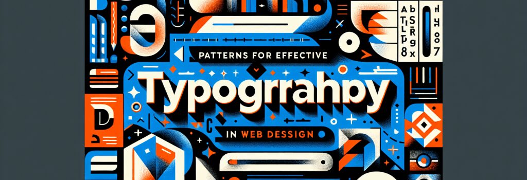
Patterns for Effective Typography in Web Design

Hello to you, raw beginners, coders in training, and the generally tech curious folks out there! Are you ready to learn, have fun, giggle a bit, and dive into the nitty-gritty of effective typography in web design? Think fonts are just about “choosing pretty letters”? Ha! It’s time to bust that myth. Get ready for an exciting journey into the fascinating world of typography.
Understanding Typography Basics
Typography isn’t exactly rocket science, but before you start acting like a kid in a digital candy store downloading fancy fonts willy-nilly, take a breath and let’s go back to the basics.
Typography is essentially about communication and psychology, not just about making things “pretty”. Choosing the right font is like choosing the right outfit for an occasion. A wedding dress at a beach party? Sure, if you want to be tagged as ‘most unforgettable’ (or do you?).
The Art of Mixing Fonts
Now that we’re clear on the basics, let’s tackle one of the biggest challenges in web design: mixing fonts. This is the equivalent of being a DJ in the typography world. But just like not every song mix ends up being a hit, not every font combination works!
There are no hard-and-fast rules to matching fonts, but generally, you want to create a sense of contrast. Think serif vs sans serif, bold vs thin, decorative vs simple. But beware of creating a font soup. Nobody likes a DJ who plays all the songs at once, and nobody likes a website that uses all the fonts. One to three different fonts are usually plenty.
Maintaining Readability and Accessibility
Now, let’s talk about the serious stuff: readability and accessibility. Internet trolls may enjoy causing trouble online, but causing headaches with your typography choices is certainly not the way to go.
Your text needs to be legible, which means you need to consider factors like color contrast, background, spacing, and font size. Likewise, the web is for everyone, so your typography should be accessible to all, including those with visual impairments.
Consider using relative units like ’em’ or ‘rem’ for font sizes. Why, you ask? Well, they are like that thoughtful friend who adjusts their volume according to how loud the party is. They adjust font sizes based on the default settings of the device or browser. How considerate!
Embracing Responsive Typography
When it comes to web design, being ‘responsively inclined’ is as essential as having a good playlist for a road trip. Just like how you wouldn’t crank up death metal with your grandma in the car (unless she’s into that kind of stuff, no judgment here), your typography needs to adapt to different devices screen sizes.
That means keeping your text readable whether it’s being viewed on a 27-inch desktop screen or a teeny mobile phone. Remember, responsive design is just web designer speak for “being considerate”.
Conclusion
Congratulations! You have dipped your toes into the marvelous sea of typography in web design. Remember, practice makes perfect. You may not become a typography guru overnight, but with what you’ve learned, you are well on your way to creating stunning websites.
What’s that, you ask? Do you need more help unleashing your inner typography beast? Fear not, because the story of typography in web design is just getting started!
So, raw beginners, remember, First Rule of Typography Club is – always have fun with it! Because who knows, someday you might effortlessly juggle fonts like a circus clown juggling bowling pins!