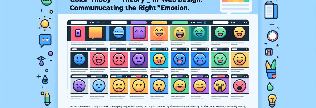
Color Theory in Web Design: Communicating the Right Emotion

—
Color Theory in Web Design: Understanding and Harnessing the Power of Colors
Introduction to Color Theory
In the vast expanse of web development and design, understanding the science and psychology behind color choices is crucial. Color theory is a cornerstone in creating visually appealing and emotionally engaging websites. It’s more than just picking appealing shades; it’s about conveying the right message and emotion to your audience. This guide delves into how you can leverage color theory in your web design projects to communicate effectively and enhance user experience.
The Basics of Color Theory
The Color Wheel and Color Relationships
At the heart of color theory lies the color wheel, a fundamental tool for combining colors harmoniously. It consists of primary (red, blue, yellow), secondary, and tertiary colors. Understanding the relationships between these colors, such as complementary, analogous, and triadic schemes, is vital for creating balanced and aesthetically pleasing designs.
Color Temperature and Mood
Colors are also associated with temperature – warm colors (reds, oranges, yellows) evoke warmth and excitement, while cool colors (blues, greens, purples) suggest calmness and professionalism. Selecting the appropriate temperature can set the mood of your website and influence how visitors perceive your brand.
Utilizing Color Psychology in Web Design
Each color invokes specific emotions and reactions. For example, blue often represents trust and reliability, making it a favorite for financial institutions. Green, associated with health and growth, is widely used by eco-friendly and wellness brands. Understanding the psychology behind colors can help you choose the right palette to convey your brand’s values and message.
Crafting the Ideal User Experience
Color affects usability and user experience. High contrast between text and background improves readability, while the right color combinations can direct attention to crucial elements like calls-to-action. A thoughtful color scheme enhances navigation and user engagement, leading to a more successful website.
Implementing Color Theory in Your Projects
Analyze Your Brand and Audience
Consider your brand’s personality and your target audience’s preferences. A vibrant, colorful website might appeal to a younger demographic, while a more subdued palette could resonate with a professional audience.
Experiment and Test
Don’t be afraid to experiment with different color schemes. Use A/B testing to see which colors perform better in terms of user engagement and conversion rates. Tools like color wheel selectors and palette generators can be invaluable in this process.
Stay Updated with Trends
While it’s important to understand the fundamentals of color theory, staying updated with design trends can inspire innovative color choices. However, ensure that these trends align with your brand identity and do not compromise the website’s usability.
Conclusion
Color theory is a powerful tool in web design, capable of influencing mood, conveying messages, and enhancing user experience. By understanding and applying the principles of color relationships, psychology, and user preferences, you can create visually appealing websites that communicate the right emotion and engage your audience more effectively. Remember, the best color choices are those that align with your brand’s identity and meet your users’ needs.
—
This simplified guide to color theory in web design underscores the importance of making informed color choices. Whether you’re a newbie or seasoned web developer, mastering the art of color can elevate your projects and help you create more impactful and user-friendly websites.