Accessibility in Web Design: Color and Typography Considerations

Creating websites that are accessible to as many people as possible is not just a matter of ethical design but also legal compliance in many regions. Among the aspects of accessibility, color and typography play pivotal roles in ensuring that everyone, including those with disabilities, can effectively interact with online content. This article delves into the importance of color and typography in web development, offering practical guidelines to enhance website accessibility.
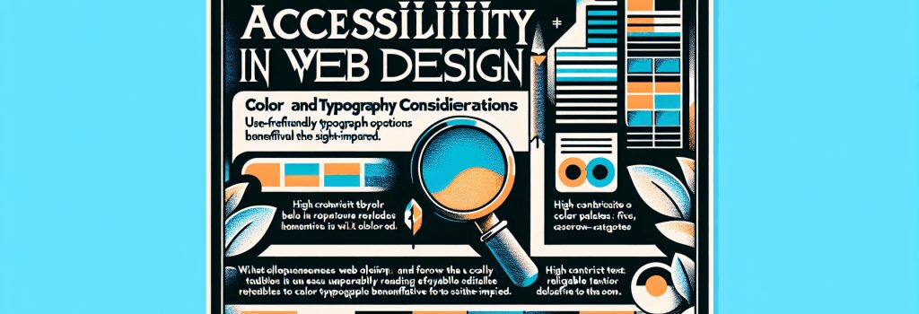
Understanding Accessibility in Web Design
Accessibility in web design means creating web pages that can be used by as broad an audience as possible. This inclusivity extends to individuals with disabilities, such as vision impairment, hearing loss, and cognitive limitations. The web, by its nature, offers an opportunity to surpass many traditional barriers to communication and interaction – if, and only if, it’s designed with accessibility in mind.
The Role of Color in Accessibility
Color is a powerful tool in web design, capable of evoking emotions, conveying messages, and creating an intuitive user interface. However, when misused, it can also present significant barriers to accessibility.
– Contrast is Key: Adequate contrast between text and its background is crucial for users with visual impairments. The Web Content Accessibility Guidelines (WCAG) recommend a contrast ratio of at least 4.5:1 for normal text and 3:1 for large text. Tools like the WebAIM Contrast Checker can help verify your color choices meet these criteria.
– Avoid Color-Dependent Information: Relying solely on color to convey information can alienate users who are color blind. Ensure that messages and prompts are clear without the need for color differentiation.
– Use of Color to Highlight Focus: For users navigating your site through keyboard input, it’s essential to visually distinguish the element currently in focus. Employing a distinct color change can aid in this navigation, enhancing the accessibility of your webpage.
Typography and Accessibility
Typography in web design is not just about choosing attractive fonts; it’s about ensuring the readability and legibility of your content for everyone.
– Choose Readable Fonts: Opt for fonts that are easy to read online. Sans-serif fonts like Arial or Helvetica are generally more accessible. Additionally, ensure that your font size is not too small – a base font size of 16px is a good starting point.
– Line Length and Spacing: To improve readability, keep line lengths to between 50-60 characters and ensure sufficient spacing between lines of text, typically 1.5 times the font size.
– Hierarchy and Structure: Utilize headings (H1, H2, H3, etc.) to structure your content logically. Not only does this benefit SEO, but it also aids screen readers in navigating your content, improving accessibility for users with visual impairments.
Best Practices for Implementing Accessible Design
Ensuring your website is accessible requires thorough planning and intentional design. Here are some best practices to consider:
– Conduct Accessibility Audits: Tools like AChecker or the WAVE Web Accessibility Evaluation Tool can analyze your web pages for accessibility compliance, highlighting areas for improvement.
– Familiarize with WCAG Guidelines: The Web Content Accessibility Guidelines serve as the gold standard for web accessibility. Understanding and implementing these guidelines can significantly improve the inclusivity of your website.
– Involve Users in Testing: Real-world testing with people who have disabilities can uncover issues that automated tools cannot. Their insights can guide more nuanced improvements to your website’s accessibility.
Creating an accessible web is a responsibility that falls on all web developers and designers. By prioritizing accessibility in color and typography decisions, you can ensure your websites are usable and enjoyable for a broader audience, thus embracing the true inclusivity that the internet promises. Remember, a more accessible web begins with design decisions that consider everyone.