How to Use Color Emotion Guide in Web Design to Affect Mood

Web design is not just about coding and functionality; it’s also about aesthetics. One significant aspect of building a website involves using color and typography to evoke different emotions and create a specific mood. These elements significantly influence how people perceive and interact with a site. In this guide, we will delve into the nuts and bolts of using the color emotion guide in web design.
Understanding the Color Emotion Guide
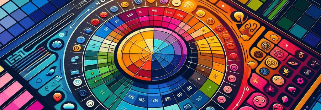
The color emotion guide is a useful tool in understanding different colors’ psychological impacts. Each color induces specific emotions and sets an immediate tone for your website – right from the moment a user lands on it. It’s indispensable to comprehend these color-emotion associations and how to use them in web design.
Red
Red is the color of intensity. It signifies passion, excitement, and even anger. You can use red to draw attention or make important elements on your website stand out.
Orange
Orange is associated with creativity and enthusiasm. It’s less aggressive than red but still draws attention. Orange is a great color to use for calls to action.
Yellow
Yellow represents happiness, optimism, and energy, making it an ideal color for websites that want to evoke a positive, cheerful vibe.
Green
Green signifies growth, harmony, and freshness. It’s a relaxing color often associated with nature and can create a peaceful environment for your website.
Blue
Blue is a color of trust and efficiency, making it a popular choice for corporate and professional websites.
The Art of Choosing Colors for Your Website
Now that we have explored what different colors represent, the next step is to choose a fitting color scheme for your website. This step requires analyzing your target audience and your brand message.
For instance, are you aiming for a youthful, vibrant audience or a more professional, mature one? What emotions do you want to evoke in your visitors?
Combining the right colors can put your audience in the mood you want, thereby increasing user engagement.
Typographic Mood
Beyond colors, the typography you choose also plays an important role in setting the mood for your website. Different typefaces evoke different feelings. For example, serif fonts are often seen as formal and trustworthy, while sans-serif fonts are typically considered modern and clean.
Match Typography with Color
Achieving a harmonious relationship between typography and color is a crucial skill. A poorly chosen color can make your text hard to read or your message difficult to understand. But, used effectively, color and typography together can bring coherence and elegance to your design.
In summary, enhancing website design is not merely a task of choosing cool elements. It’s about making those elements work together harmoniously to deliver a desired emotional response. Understanding and applying the principles of the color emotion guide and typography in your designs will significantly enhance your web development skill set.


