Crafted Tech Daily
Створення адаптивного дизайну в WordPress без використання плагіна

Звісно, давайте зануримось безпосередньо в басейн коду, але не забудьте надягнути технічні підводні окуляри. Ми збираємося побачити красу WordPress-екосистеми без підтримки плагінів-поплавків! Окей, глибокий подих, і давайте пливемо у глибини Океану Коду!
Чому обирати адаптивний дизайн?
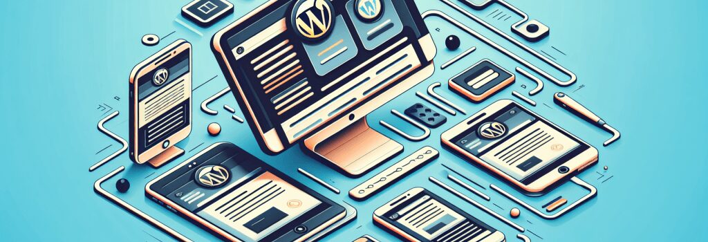
Перш ніж розпочати кроки, важливо зрозуміти, чому ми це робимо. Чому обирати адаптивний дизайн для вашого веб-сайту? Ну, друже, в цьому надшвидкому цифровому світі відвідувачі вашого веб-сайту можуть переглядати його з різних пристроїв. Нам потрібно розстелити червоний килим для всіх, чи то вони користуються настільним комп’ютером, мобільним телефоном чи планшетом. Неадаптивний дизайн буде схожий на запрошення гостей на обід і забуття основного страви, цілком незручно, чи не так? Тепер, коли ми чітко усвідомили наші причини, давайте поглибимося в безодню коду.Розуміння структури WordPress
По-перше, нам потрібно осмислити структуру нашого сайту WordPress. Подумайте про це як про організацію брудної шухляди. У нас є Хедер, Контент, Бічна панель та Підвал.Налаштування простого запиту мультимедіа
Першим кроком у нашому пригоді є налаштування простого запиту мультимедіа. Запит мультимедіа, для тих, хто цікавиться, не є новинним звітом про соціальний медіа скандал. Це техніка CSS, яка використовується для застосування стилів до різних розмірів екрану.Щоб створити запит мультимедіа, ви поглиблюєтеся у CSS-файл своєї теми та додаєте рядок коду. Ось як це виглядає під водою, не забудьте відрегулювати ваші окуляри!
<pre><code>CSS
@media (max-width: 600px) {
/ Додайте стилі CSS тут /
}
Ця настройка означає, що будь-який стиль, який ви залишите всередині його затишних дужок, застосовуватиметься до екранів менших за 600px шириною. Тепер давайте налаштуємо.
Налаштування хедера
Щоб зробити ваш хедер адаптивним, заглибіться у свій CSS-файл. Шукайте правила CSS, які застосовані до вашого хедера. Тепер уявіть, що ви детектив, який шукає вказівки для того, щоб зробити його адаптивним. Вам може знадобитися відрегулювати розміри шрифтів, вирівнювання або навіть приховати деякі елементи. Тут ваш надійний помічник – це метод проб та помилок.Робота з випадаючим меню
У відправному дизайні, обробка навігаційного меню схожа на боротьбу з гігантським кальмаром. Ви хочете, щоб воно зменшувалося та аккуратно вписувалося в випадаюче меню, яке відкривається та закривається при натисканні. Для цього вам потрібно зручно володіти JavaScript або JQuery разом із CSS.Налаштування контенту та бічної панелі
Вже відчуваєте себе дослідником морського дна? Чудово, адже наступним кроком буде маніпулювання контентом та бічною панеллю. Аналогічно до хедера, ви захочете відрегулювати стилі різних елементів, щоб вони гарно вписувалися на різних екранах.Сортування підвалу
Останнє, але не менш важливе, не забудьте про підвал. Ви можете зробити його адаптивним так само, як ви це зробили з іншими розділами.І ось вам, мій друг, ви створили адаптивний веб-сайт на WordPress без плагіна. Ви успішно проникли в океанське дно коду!
Сподіваюсь, що вам сподобалася ця занурення, не забудьте зняти свої підводні окуляри, коли ви виходите; ми не хочемо продовжувати бачити світ у CSS тепер, чи не так? Продовжуйте практикувати, і скоро ви станете Жаком Кусто веб-розробників! Щасливого кодування!
Питання-відповіді
How can I make my WordPress site responsive without relying on plugins?
There are a few key steps you can take to make your WordPress site responsive without using a plugin.
What is the importance of responsive design in WordPress?
Responsive design ensures that your website can adapt to different screen sizes and devices, providing an optimal viewing experience for all users.
Are there any specific CSS techniques I can use to make my WordPress site responsive?
Yes, CSS media queries are a powerful tool for making your site responsive. By defining different styles based on screen size, you can create a fluid layout that adjusts to different devices.
How can I test the responsiveness of my WordPress site during development?
You can use your browser’s developer tools to simulate different screen sizes and test how your site responds. Additionally, you can test your site on real devices to ensure it looks good everywhere.
What are some best practices for optimizing images in responsive design?
To optimize images for responsive design, consider using responsive image techniques like srcset and sizes attributes, as well as compressing images to reduce file size without sacrificing quality.
What role does viewport meta tag play in creating a responsive WordPress site?
The viewport meta tag controls the width and scale of the viewport on mobile devices, helping your site to display correctly and be more user-friendly on smaller screens.
How can I make navigation menus responsive in WordPress?
You can use CSS techniques like flexbox or media queries to create responsive navigation menus that adapt to different screen sizes, ensuring easy navigation for all users.
Why is it important to prioritize content hierarchy in responsive design?
Content hierarchy ensures that the most important information on your site is prominently displayed, even on smaller screens. This helps users quickly find what they’re looking for without getting lost in cluttered layouts.
How can I ensure a consistent user experience across different devices in WordPress?
By testing your site on various devices and screen sizes, optimizing performance, and focusing on usability, you can create a consistent and enjoyable user experience for all visitors.
Are there any common pitfalls to avoid when creating responsive designs in WordPress?
Some common pitfalls to avoid include neglecting performance optimization, overlooking mobile-specific design considerations, and failing to test your site thoroughly on different devices.
# Happy coding and remember, a responsive website is a happy website! 🌐📱