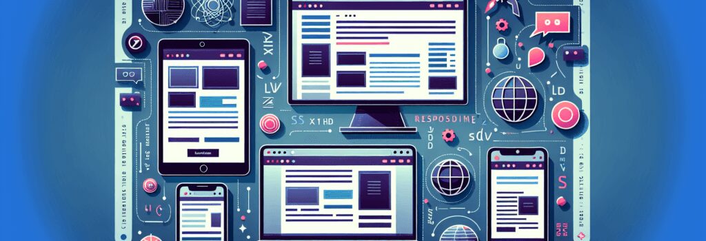
Основи адаптивних зображень та медіа в веб-дизайні

Закатайте рукави, візьміть чашку гарячого кави або шоколаду –– або чаю, якщо ви такий тип людини –– оскільки ми збираємося поглибитися у захопливий світ респонсивних зображень та медіа в веб-дизайні!
Спочатку давайте розберемося з основами. У кібер-всесвіті “респонсивність” не стосується того, як швидко відповідає ваш віртуальний помічник, хоча всі ми любимо трохи миттєвого задоволення! У веб-дизайні респонсивність вказує на те, як елементи на веб-сторінці, включаючи зображення та медіа, автоматично адаптуються, або “реагують”, щоб підігнатися під різні розміри екрану та роздільну здатність. Круто, чи не так?
Навіщо турбуватися про респонсивні зображення та медіа?
У веб-розробці є правила, є хороші практики, і є королівські накази. Роблення зображень та медіа респонсивними відноситься до останньої категорії. З усіма і їхніми домашніми тваринами, що володіють кількома пристроями в наші дні, критично важливо, щоб ваш веб-сайт виглядав добре та працював відмінно на кожному розмірі екрану, чи то смартфоні, планшеті або настільному комп’ютері.
Використання респонсивних зображень та медіа також може допомогти покращити швидкість завантаження вашої веб-сторінки та загальний досвід користувача. Хто б не хотів швидкого веб-сайту, який користувачі абсолютно обожнюють?
Як використовувати респонсивні зображення та медіа в веб-дизайні?
Тепер, коли ми розібралися з “чому”, давайте перейдемо до “як”. Я обіцяю, це так само просто, як приготування торта –– ну, дуже високотехнологічного торта!
HTML для респонсивних зображень
Щоб зробити зображення респонсивним за допомогою HTML, ви використовуєте властивість max-width. Це гарантує, що зображення масштабується вниз, якщо потрібно, але ніколи не масштабується, щоб виглядати більшим, ніж його оригінальний розмір. Ось базовий приклад:
img {
max-width: 100%;
height: auto;
}
У цьому фрагменті коду ;max-width: 100%;> означає, що зображення займатиме до 100% ширини свого контейнера. Таким чином, якщо ви переглядаєте веб-сайт на мобільному пристрої, зображення буде відповідно зменшуватися.
З іншого боку, ;height: auto;> зберігає пропорції зображення при масштабуванні вгору чи вниз. Оо, це дуже цікавий трюк, чи не так?
Медіа-запити для респонсивних медіа
Медіа-запити – ще один чарівний трюк у рукаві веб-дизайнера. Використовуючи їх, ви можете встановити певні CSS-стилі для різних розмірів пристроїв. Типовий медіа-запит для роблення ваших медіа-елементів респонсивними може виглядати приблизно так:
@media (max-width: 600px) {
.responsive-media {
width: 100%;
height: auto;
}
}
У цьому прикладі медіа-елементи з класом ;.responsive-media> будуть зменшуватися, щоб вписатися на екрани шириною 600 пікселів чи менше. Згасле освітлення, шепотіння та вигук враження абсолютно необов’язкові, коли ви пишете цей шматок коду!
Отже, ось і все! Основи респонсивних зображень та медіа в веб-дизайні, спрощені та розголені для початківців. Пам’ятайте, практика робить майстра. Продовжуйте кодити, вдосконалюйтеся, і перед тим, як заметите, ви будете створювати веб-сайти, які навіть ваш домашній улюбленець одобрить!
Цього все на сьогодні! Наступного разу ми пірнемо у загадковий, але дивовижний світ PHP. До зустрічі, товариші з кодування!