Posts with tag “flexible images”
Learn how to create responsive web designs with flexible images. Discover techniques for ensuring that images adapt to different screen sizes and devices, improving the overall user experience. Master the use of CSS properties like max-width and height:auto to make your images fluid and scalable across various viewports.
Read more
Responsive Web Design: Principles and Practices with CSS
Making Your Website Look Good on Any Device with Responsive Web Design Hello there! ...
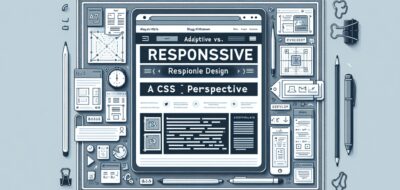
Adaptive vs. Responsive Design: A CSS Perspective
Understanding Adaptive and Responsive Design in CSSIn today’s fast-paced digital world, creating websites that ...

Responsive Design: Making Your Websites Mobile-Friendly
Understanding Responsive Design for Web DevelopmentIn today's digital age, creating websites that look great ...

Responsive Design Techniques for WordPress Themes
Responsive design is integral in creating websites that provide an optimal viewing experience across ...

Responsive Web Design with HTML and CSS
---Mastering Responsive Web Design with HTML and CSSIn today’s digital era, creating websites that ...