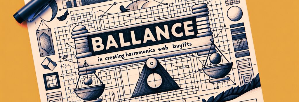
The Role of Balance in Creating Harmonious Web Layouts

Creating harmonious web layouts requires a careful consideration of various design principles. Among the most critical of these is the concept of balance, which plays a pivotal role in achieving visually appealing and easily navigable websites. In this chapter, we delve into how understanding and applying balance can enhance your web development projects, particularly when working with technologies like HTML, CSS, JavaScript, and platforms like WordPress.
Understanding Balance in Web Design
Balance in web design refers to the distribution of visual weight across a layout. This can pertain to colors, textures, shapes, and even the arrangement of text and images. Achieving balance doesn’t necessarily mean mirroring elements on either side of a central axis (symmetrical balance), but rather, ensuring that the composition feels stable and visually coherent.
Types of Balance
1. Symmetrical Balance: This is where elements of the design are mirrored on either side of a central line. It’s common in more traditional and formal websites, offering a sense of stability and order.
2. Asymmetrical Balance: This involves creating equilibrium through unequal visual weight on either side of the layout. It’s more dynamic and often used in modern web design to create interest and movement.
3. Radial Balance: Elements are arranged around a central point, radiating outwards. This can be a powerful way to draw attention to a specific part of the page.
Implementing Balance in Your Web Layouts
To effectively apply balance within your web development projects, consider the following strategies:
Utilize Grid Systems
Grid systems, a fundamental aspect of web development with CSS, provide a structural basis to help distribute elements evenly. By adhering to a grid, you’re more likely to achieve a balanced layout that feels organized and easy to navigate.
Consider the Visual Weight of Elements
Different elements carry different visual weights. For instance, a large, bold image will draw more attention than a small, light-text paragraph. When crafting your web pages, balance these elements by considering their size, color, and position on the page.
Leverage White Space
Sometimes referred to as negative space, white space is the area around and between elements. It’s a crucial tool for creating balance, as it allows your design to breathe and prevents it from feeling cluttered.
Test and Iterate
Balance is often achieved through trial and error. Use developer tools available in browsers to tweak and adjust your layouts. Experiment with different arrangements until you find a harmonious balance. Tools and plugins available for WordPress can also aid in visually adjusting layouts until the desired balance is achieved.
The Impact of Balance on User Experience
A well-balanced website not only looks aesthetically pleasing but also enhances user experience. Users are more likely to engage with and navigate through a site that feels orderly and coherent. It instills a sense of reliability and professionalism, crucial for retaining visitors and encouraging them to explore more content.
Conclusion
Mastering the principle of balance is essential for any web developer aiming to create impactful and user-friendly websites. By understanding its types and implementing strategies to achieve it, you can enhance the visual appeal and functionality of your web projects. Remember, a balanced web layout is more than just a pleasing design; it’s the foundation of a positive and engaging user experience. As you advance in your web development journey, continually refine your ability to create balanced designs, keeping in mind that the ultimate goal is to serve and satisfy your users.