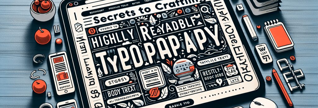
Secrets to Crafting Highly Readable Web Typography

So, you’ve decided to dive into the colorful world of web development, huh? That’s great! Brace yourself for a wonderful journey filled with tags, cascading stylesheets, and maybe a few moments of frustration. A good sense of humor is recommended, because, let’s face it, sometimes those pesky semicolons can drive you up the wall!
Now let’s move onto an aspect of web development that readers actually see: Typography. It’s the craft of making text readable and it falls under the umbrella of ‘Design Fundamentals’.
Let’s Get the Big Picture Right!
In web development, we are not just creating web pages, but an experience. The user should be able to interact with the website and, dare I say, enjoy it! The content is of course important, but even the best content can become useless if the reader can’t actually read it. This is where typography comes into play.
The typeface, the font size, the line spacing, they all contribute to how the user perceives the website. Fine-tuning these elements can do wonders.
The Typeface
To make a choice here, think about the character of the text. Playful text might go well with a cursive or decorative font, like Comic Sans. On the other hand, for a professional website, a more formal font like Arial or Times New Roman might be used.
The Font Size
Is small beautiful, or is it just hard to read? For body text, a good size is around 16px. This can of course vary depending on the typeface, but it’s important to keep readability in mind.
Line Spacing
Next up is line spacing – and it’s just as important as it sounds. Too close, and the lines start to blend together. Too far apart, and each line feels like an island. A nice middle ground provides enough breathing space, allowing for comfortable reading.
Let’s not forget about color and contrasts. Color theory isn’t just about choosing your favorite hue. It’s about setting the mood and improving readability.
Colors and Contrast
Black text on a white background is classic for a reason: high contrast helps with reading. If you are adventurous and want to experiment with colors and backgrounds, go for it, but remember, high-contrast combinations are usually more reader-friendly.
And there you have it! The basics of web typography. Let’s be honest, it ain’t rocket science, on the surface it’s just about making text readable. But dig a little deeper, and you’ll find that there’s a lot of science – and art – involved.
So, tighten your seatbelt and get into coding mode, because creating highly readable web typography is part science, part art, and all fun! And remember, developing is an iterative process. What works today, might not work tomorrow. So, keep iterating and keep learning. Happy developing!