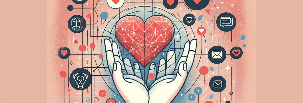
Emotional Design: Creating Websites That Connect

Alright, strap yourselves in, fellow web developers (to be)! Today, we’re diving deep into the not-so-spooky world of Emotional Design. The single teardrop on your ‘Hello World’ PHP page isn’t going to cut it, I’m afraid. We’re bringing out the big guns — the secret sauce of developing websites that connect, engage, and most importantly, make your visitors feel things. Buckle up, because we’re about to embark on a magical journey into the heart of your website and the minds of your users.
The Basics of Emotional Design
Okay, enough with the dramatic intros. Let’s talk Emotional Design.
First things first: Emotional Design is not overloading your website with cat memes (though, that could be an interesting experiment). Rather, it’s all about shaping a user experience that influences visitor emotions in a positive manner. It goes beyond the cut-and-dry parameters of site usability and taps into the sweet spots of human connection, comprehension, comfort, and even surprise!
Every single element on your site, from your logo to the pop-up chatbot, can empower emotional design.
The Art Of Storytelling
Telling stories can strongly affect emotions. So, snuggle up with your warm cup of coffee and a warm blanket, because we’re going straight into the land of make-believe.
Just kidding, kind of.
Your website is all about narrating the story of your brand, your values, and your unique selling proposition. And your users don’t just want to hear the story; they want to be a part of it. Use design elements like color schemes, typefaces, content, and animations to bring your story to life and make your audience a part of its unfolding.
However, steer clear of the “Once Upon A Time” cliché, unless you’re selling fairy-tale books or magic wands.
Keys To Unlocking Emotional Design
Now, that we’ve set the stage, let’s talk about the keys to creating an emotionally resonant designs.
Colors and Brands
No, we’re not talking about coloring books, though they can be quite fun and therapeutic. We’re talking about the color palette of your website, essential for establishing mood and evoking emotions.
Red screams “ALERT!” or defines passion, while blue whispers of reliability and calm. Identify your brand personality and choose your colors wisely.
Typography Talks
Font type and size also help set the tone. Since we’re staying away from shouty capitals, think of the message you want your typeface to convey — casual, professional, creative? Beaucoup choices, I tell you.
Images and Icons
A picture can indeed be worth a thousand words, or at least a thousand site hits. Relevant, impactful visuals not only capture attention but can also provoke emotion. The same goes for icons — they need to be intuitive, engaging, and aesthetically pleasing.
User-Driven Content
Remember, the aim is to make users a part of your story. Interactive elements like quizzes, surveys, or feedback forms allow users to engage and invest in your narrative.
In Conclusion
Creating emotionally engaging designs might seem like chasing a unicorn through a maze, but with some creativity and a spark of imagination, it can be a highly fulfilling journey. It’s not about manipulating emotions but about creating a genuine human connection.
Alas, our journey must come to a close, for now. In our next chapter, we will take a closer look at what colors to avoid if you don’t want your website to look like a psychedelic nightmare. Don’t forget your palette!


