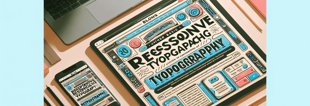
Understanding the Basics of Responsive Typography

Welcome to a world where size does matter, it really does! Your first thought might be, “Isn’t this about fonts? Are typefaces that serious?” Fear not, my young padawan. Strap on your coding helmet, don your designer’s cape, we’re embarking on an epic journey into the world of Responsive Typography.
What on Earth is Responsive Typography?
Typography is an ornate term for “stuff that has to do with typefaces” and by typefaces, we mean fonts, sizes, spacing, colors, you name it.
Responsive, on the other hand, is the “one-size-fits-all” superhero of web design. A responsive design ensures your web content gracefully adapts to different displays from a desktop monitor to a smartphone screen.
Combining the two, we get Responsive Typography, the art of orchestrating your textual content to appear aesthetic, legible, and appealing on all devices. The font size of your grandma’s knitting blog shouldn’t appear as big as a billboard on a mobile screen, right?
The Core Principles of Responsive Typography
1. Relative Units
Don’t you miss the simpler times you thought ’em’ and ‘rem’ were just cute abbreviations for Emily and Remember? Here, they’re unit measurements relative to a base size, often the browser’s default font size. Using px (pixels) is so 2000 and late. Welcome to the age of ’em’ and ‘rem’.
2. Line Length (Measured in Characters per Line)
Does reading an e-book where each line extends to the horizon tire you out? Ideally, a line should contain 45-75 characters. An owl’s eyes might move in two different directions, sadly, human eyes don’t.
3. Line Height (The Space between Two Lines of Text)
Ever been smacked in the face by a wall of text? It’s unpleasant, my friend. Proper line height encourages eye flow like a lyrical line of poetry, it just flows.
Making our Typography Responsive
1. Tip-top Typography
To ensure consistency, we must dodge the reckless choice of using pixels to specify type sizes. Instead, we’ll use percentage or ’em’ units.
Example-2 for humor: Don’t be the pixel-peasant, be the percentage prince/princess!
2. Media Queries and Breakpoints
Given the overwhelming device options, we need our text to respond and adapt. The magic term is Media Queries. They allow us to apply CSS rules depending on the viewport or device properties.
Fortunately, it isn’t as complex as it sounds. It’s like telling young children $25 chocolate bar does not fit into your $10 pocket money budget!
Conclusion
Responsive Typography is a formidable force in the toolkit of a web designer. Like a well-tailored outfit, it lends unparalleled elegance and aesthetics, while ensuring a snug fit for all devices.
And remember, while there’s no “i” in team, there’s an “i” in Responsive Typography. Go forth, intrepid developer, and make the web a more aesthetic, responsive place!