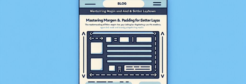
Mastering Margin and Padding in CSS for Better Layouts

Understanding the Essentials of Margin and Padding in CSS
As we delve into the world of web development, mastering the intricacies of CSS is crucial for creating visually appealing and user-friendly websites. Two fundamental concepts that play a pivotal role in CSS styling and layout are margin and padding. These properties help control the spacing and alignment of elements on a web page, making them indispensable tools for any aspiring web developer.
Margins in CSS: Controlling External Spacing
Margin refers to the space around an element’s border, affecting the distance between the element and other items on the page. It is one of the most utilized properties for creating visually balanced web layouts.
How to Use Margin Efficiently
– Individual Sides: You can set margin values for the top, right, bottom, and left sides of an element separately using ;margin-top>, ;margin-right>, ;margin-bottom>, and ;margin-left>.
– Shorthand Property: For more concise code, CSS allows the use of the ;margin> shorthand property, enabling you to set all four margins at once or specify individual sides in a clockwise notation.
– Auto Value: Using ;margin: auto;> can be particularly useful for centering elements horizontally within their containing element.
Understanding how to manipulate margins is essential for creating responsive layouts that adapt to different screen sizes and devices.
Padding in CSS: Managing Internal Spacing
Padding, on the other hand, refers to the space between an element’s border and its content. This property is vital for improving content readability and attractiveness.
Optimizing Padding for Enhanced Layouts
– Control Each Side: Similar to margin, padding allows you to specify values for each side of an element (;padding-top>, ;padding-right>, ;padding-bottom>, ;padding-left>).
– Shorthand Syntax: Use the ;padding> shorthand property to define the padding for all four sides simultaneously or to target specific sides with a single declaration.
– The Box Model Concept: Understanding the CSS Box Model is crucial as it clarifies how margins, borders, paddings, and the actual content area interact. Padding increases the overall size of the element unless the ;box-sizing: border-box;> property is applied, which makes the padding (and border) included in the element’s defined width/height.
Combining Margin and Padding for Sophisticated Layouts
To achieve advanced and responsive designs, web developers must skillfully combine margin and padding properties. This combination allows for the precise positioning of elements, enhanced aesthetic appeal, and improved user interface design.
Practical Tips for Utilizing Margin and Padding
1. Consistent Spacing: To maintain a harmonious design, use a consistent spacing scale for margins and paddings throughout your site.
2. Responsive Design: Apply relative units like percentages or ems for margin and padding values to ensure your layout adapts well to various screen sizes.
3. Debugging Layout Issues: Utilize browser developer tools to inspect and experiment with margin and padding values, simplifying the debugging process.
By thoroughly understanding and applying margin and padding in CSS, you can create sophisticated layouts that not only look great but also offer an intuitive and engaging user experience. Remember, the key to mastering web design lies in practicing and experimenting with these properties to discover how they best serve your design goals.


