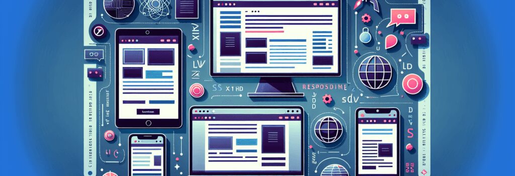
The Basics of Responsive Images and Media in Web Design

Roll up your sleeves, grab a cup of hot coffee or chocolate –– or tea, if you’re that kind of person –– because we’re about to dive into the exciting world of responsive images and media in web design!
First, let’s get the basics out of the way. In the cyber universe, ‘responsive’ isn’t about how quickly your virtual assistant answers, though we all love a bit of instant gratification! In web design, responsiveness refers to how elements on a webpage, including images and media, automatically adjust, or ‘respond,’ to fit various screen sizes and resolutions. Cool, isn’t it?
Why Bother about Responsive Images and Media?
In web development, there are rules, there are good practices, and then there are royal commands. Making images and media responsive falls into the last category. With everyone and their pet dog owning multiple devices these days, it’s critical for your website to look good and perform superbly on every screen size, be it a smartphone, tablet, or desktop.
Using responsive images and media can also help improve the load speed of your webpage and the overall user experience. Now, who doesn’t want a lightning-fast website that users absolutely love?
How to Use Responsive Images and Media in Web Design?
Now that we’ve got the ‘why’ figured out, let’s get into the ‘how.’ I promise it’s as easy as baking a cake –– well, a very high-tech cake!
HTML for Responsive Images
To make an image responsive with HTML, you use the max-width property. This ensures that the image scales down if it has to, but never scales up to appear larger than its original size. Here’s a basic example:
In this code snippet, ;max-width: 100%;> means the image will take up to 100% of its container element’s width. So, if you’re viewing the website on a mobile device, the image will shrink down accordingly.
On the flip side, ;height: auto;> maintains the image’s aspect ratio when it scales up or down. Ooh, that’s a neat trick, isn’t it?
Media Queries for Responsive Media
Media queries are another magic trick up the web designer’s sleeve. Using them, you can set specific CSS styles for different device sizes. A typical media query to make your media elements responsive may look something like this:
In this example, the media elements with the class ;.responsive-media> will shrink to fit screens that are 600 pixels narrow or smaller. The dimmed lighting, whispered secrets, and gasps of surprise are totally optional when you write this piece of code!
And there you have it! The basics of responsive images and media in web design, simplified and stripped down for beginners. Remember, practice makes perfect. Keep coding, keep refining, and before you know it, you’ll be creating websites that even your pet dog will swipe right on!
That’s all for today! Next time, we’ll be diving into the mystifying yet awesome world of PHP. See you then, coding comrade!