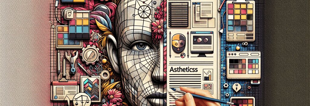
The Art of Balancing Functionality and Aesthetics in Web Development

Once upon a time, in a galaxy astronomically far away, websites were as plain as a cream cracker. They were all about function and not so much about aesthetics. Fast forward to the present day, and the bar has been raised. Today, websites are the digital face of your brand, and they must be spick and span. Whether it’s for a multinational corporation or your mom’s cat’s blog, it’s not just about what a website does, but also how it looks while doing it. Welcome, dear Coders-in-training, to the adventure-filled universe of balancing functionality and aesthetics in web development.
Understanding the Tightrope Act
Think of web development as a juggling act. On one hand, you have ‘functionality,’ which represents everything a website is supposed to do. It’s the heart of your website, pumping out data, running scripts, displaying content, and more.
On the other hand, you have ‘aesthetics,’ the beauty pageant contestant of the web universe. Aesthetics is not just about how your website looks, but also how it feels. A website could have fantastic features but if it’s as attractive as a slug in a salad, it won’t have many visitors.
So, one hand is juggling ‘doing,’ and the other is juggling ‘looking good.’ That’s our job as web developers – to keep those balls of functionality and aesthetics in the air without letting either one crash to the ground.
Cracking the Code of Balance
Remember the first rule of the Web Development Club: Every website is unique. There’s no one-size-fits-all answer to balancing functionality and aesthetics. However, there are some tricks of the trade that can guide you on your path to becoming a web development Yoda.
Embrace the Power of Usability Testing
Usability Testing: the secret sauce of web development. It’s like an early screening of a movie where you use a tiny sample of your intended audience to test the functionality and aesthetic appeal of your website. Usability testing gives you valuable insights and helps you make adjustments before the full release.
Navigate the Maze of User Experience (UX)
UX is about giving your user an epic journey through your website. An aesthetically pleasing user interface is crucial, but so is ease of navigation. If visitors feel like they’re in a maze, lost and frustrated, all the aesthetics in the world won’t make them stay.
Master the Craft of Consistency
Consistency is the charming cousin of aesthetics. Keep your color scheme, fonts, and general layout consistent across all pages. If every page feels like a separate website, your visitors might develop digital whiplash.
Command the Challenge of Performance and Speed
A Lamborghini is useless if it can only go 5 miles per hour. Similarly, a beautiful website that takes forever to load will drive users away. Keep your site speedy and sprightly by optimizing images, caching your pages, and minifying your CSS and JavaScript files.
Soldier on, brave Coders-in-training! With every line of code you write and every pixel you push, you’re getting closer to perfecting that fine balance between functionality and aesthetics. Remember, every great website is a beautiful marriage of the two. It takes time, patience, and a lot of coffee, but the result is a fabulously functional and attractive website that’s set to conquer the digital universe.


