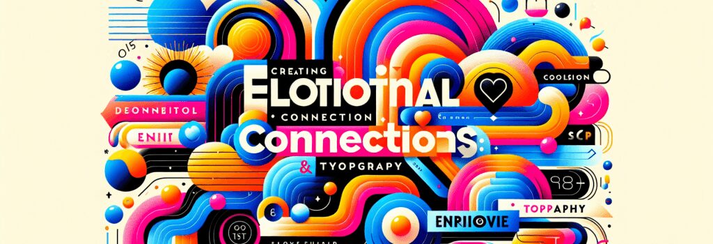
Creating Emotional Connections Through Color and Typography in Web Design

Creating Emotional Connections Through Color and Typography in Web Design
Introduction
In the realm of web development, mastering the technical stack of HTML, PHP, CSS, JS, and WordPress is fundamental. However, to create truly engaging and memorable websites, understanding the principles of design is equally crucial. Among these principles, color theory and typography stand out for their powerful ability to elicit emotional responses from users. This article delves into how these elements can be utilized to forge strong emotional connections with your audience, enhancing the overall impact of your web design.
Color Theory in Web Design
The Psychology of Color
Colors play a pivotal role in web design, influencing perception and emotions. Each color can evoke different feelings; for example, blue often represents trust and stability, making it a popular choice for banking sites, whereas orange can evoke enthusiasm and excitement, commonly used for call-to-action buttons.
Applying Color Theory
To create an emotionally resonant website, consider your brand’s message and the emotions you wish to evoke. A well-thought color scheme can enhance user experience and engagement. Use contrasting colors for readability and stick to a consistent palette to maintain harmony and balance.
Typography in Web Design
The Impact of Typography
Typography is not just about choosing fonts; it’s about conveying a message and establishing a tone. The font type, size, spacing, and layout can significantly affect how your content is received. Serif fonts, for example, are often seen as traditional and reliable, whereas sans-serif fonts are viewed as modern and approachable.
Crafting an Emotional Connection Through Typography
To leverage typography effectively, consider the emotional undertone of your content. Use typography to complement your message, ensuring readability and visual appeal. Mix and match fonts judiciously to highlight important sections and maintain the user’s interest.
Combining Color and Typography for Maximum Impact
Integrating color theory and typography can elevate your web design from merely functional to deeply impactful. The intertwining of these elements can guide users’ emotions, directing their attention and making your website more memorable.
Implementing Harmonious Designs
Achieving harmony between color and typography requires a delicate balance. Ensure that your text is legible against your color choices and that your overall design aligns with your brand’s identity and message. Test your designs across different devices to ensure consistency and readability.
Conclusion
The power of color and typography in web design goes beyond aesthetic appeal; it’s about creating a connection that resonates on an emotional level. By thoughtfully applying the principles of color theory and typography, you can craft compelling web designs that engage, inspire, and persuade your audience. As web developers, expanding our skills to include these design fundamentals can make our projects not just visually appealing, but emotionally captivating.


